DATA PRESENTATION & VISUALIZATION
METHODS
Data visualization is
the method of consolidating data into one collective, illustrative graphic.
Traditionally, data visualization has been used for quantitative work but ways
to represent qualitative work have shown to be equally as powerful. Data
visualization excels in capturing a viewer’s attention and holding it through storytelling. It addresses a complex
problem that could be easily looked over, and simplifies it using design. Naturally, a new market for business
has emerged. By taking the data and turning it into visual content, users are
more likely to engage with and share it.
The three industries over which I will be analyzing the use to date visualization are:
- Financial Management
- HealthCare Management
- E-commerce
Financial
Management essentially deals with numbers and more numbers. Storing all of them
in an excel file and then massaging the data to come to a meaningful conclusion
is tedious, confusing and prone to human error.
Recommendation:
Executive Dashboard
This
executive dashboard displays financial metrics and sales metrics such as Margin
by Month, Sales Distribution, Monthly Support Expenses, Monthly Revenue, etc.
Column
charts, just like bar graphs, serve dashboard readers by helping them visualize
categorical data and comparing it side by side. The main purpose of both the
column and line chart remains the same, even when they are combined. Columns
are best used to represent categorical data, while lines displays the
distribution of data over time (trend).
Key
Visualizations:
Gauges:
To visually depict the range of expenses
Maps,
Area charts: To visually depict the sales distribution across locations
Line
charts: To analyze the Margin, Revenue and Expenses.
Healthcare Management:
Anyone
who has been a patient in a hospital will probably agree that the experience
has room for improvement. Much of that sentiment stems from the fact that
hospitals are complex production facilities. Instrumentation and the proper use
of data and knowledge can make a real difference when it comes to improving
patient care.
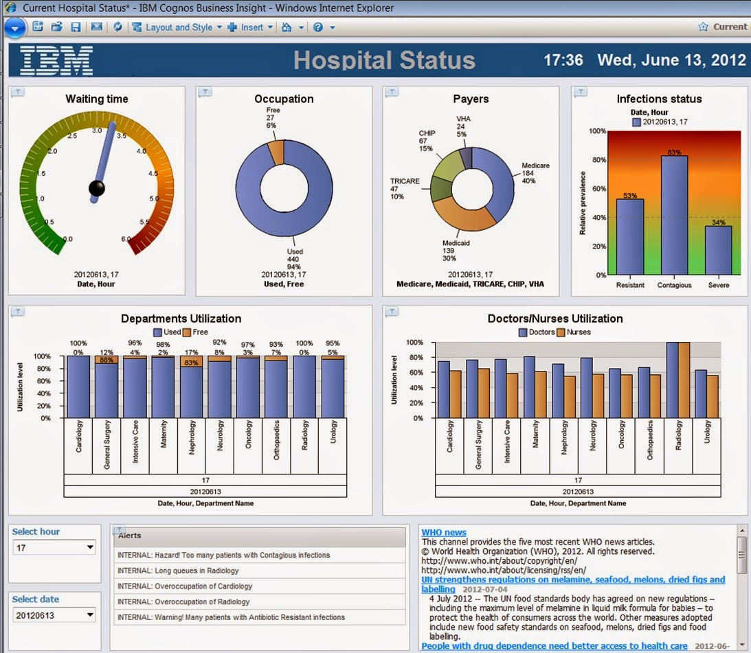
Recommendation:
Hospital
executives can get a better picture of what's going on from the operation’s
point of view and can gain additional insights and better understanding through
analysis of ”what if” scenarios: What if we discharge all mothers of newborn
babies a day early? How many beds will then be available? How will it affect
readmission? What will be the associated costs? Is there a subgroup for which
earlier discharge provides higher benefits? Using a dashboard that
incorporates wide variety of graphs, meters and displays, healthcare
administrators can make informed short-term tactical decisions while gaining
insight into how their decisions will affect various outcomes, staff groups,
and finances.
Key
Visualization:
Pie
Charts: To analyze top insurance payers.
Stack
Bars: To compare utilization between Doctors and Nurses and the department
utilization.
Gauges:
To track patient wait time by date and hour.
E-commerce
In
the competitive ecommerce market, companies have to keep a real-time track of
their product performance classified regionally, their top performing stores,
channels etcetera. If all of this data is displayed individually, it is
difficult to comprehend it and it is overwhelming too. An analyst will have to
look through multiple files to assess the data via store, location, and
product. As the filter criteria to analyze increases, the number of files
increases too. In such an event, it is also highly probable that some data may
be misread or misanalysed.
Recommendation:
Dashboards
and e-commerce analytics provide visibility for different departments to see
information that’s relevant to them. Distributors can use these tools to
improve decision-making because they paint a big picture of the data.
Viewing
this data in the form of a geo map and a bar chart will be easier and more
meaningful.
Key
Visualizations:
Waterfall
Chart: helps in understanding the cumulative effect of sequentially introduced
positive or negative values
Geo
Map: For a visually appealing overview of sales by region.
Stacked
Bar Chart: To depict the region wise top performing stores in a state
Conclusion
Data is often meaningless without context and visually
representing information offers
audiences important context for understanding the information. It
helps that data
visualization and aesthetics often come hand-in-hand. Designed
information can help viewers, especially those visual learners, cut through
unnecessary details to make sense of the world.
References:
http://www.birst.com/learn/resources/visualization-gallery#
http://www.sweetspotintelligence.com/en/2014/10/09/focus-visualizations-combo-charts/
http://www.dashboardinsight.com/articles/new-concepts-in-business-intelligence/big-data-what-it-means-for-data-visualization-and-dashboard-applications.aspx
http://www.conceptdraw.com/How-To-Guide/data-visualization-solutions


